I’m not a visual designer.
However, I enjoy creating delightful experiences, ensuring users understand the information presented and can take the next step if interested. I apply design principles, even if they may not always be executed in the most pixel-perfect way.
This is an overview of a real estate website I recently consulted on.
First, I took note of my initial feelings and observations when looking at the website.
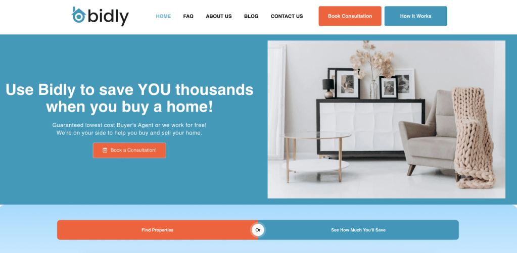
- I felt overwhelmed.
- I felt unsure.
- How will I save money?
- How are they the lowest-cost buyer’s agent?
- The stock photo felt too generic.
- I liked the simple navigation.
- I didn’t want to read the text, likely due to layout or size.
- Two primary buttons competed for my attention.
Not a five-star experience.
Instead, the user should feel confident in understanding the service to then decide whether to book a consultation.
Seeing an increase in the number of consultations booked is the metric we’re hoping to see increase here.
Again, not a designer, but I created some rough visuals below applying principles of simplicity and clarity.
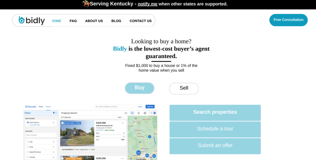
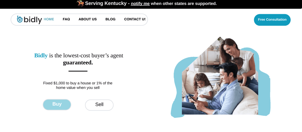
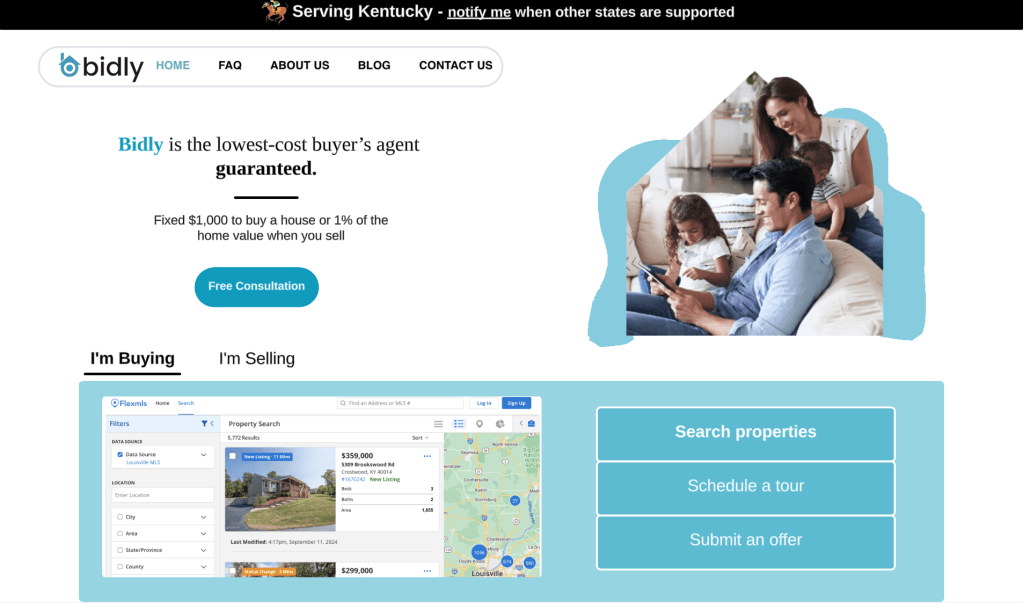
At this point, the fastest way to test this is likely to do some user interviews.
Hypothesis: By removing visual complexity and including the cost of buying and selling a home, we will see an increase in the number of people who book a consultation.
Testing Method: Present the current design, and then each of the above designs to users who are looking to buy a house, and ask the following questions:
- Based on what you see here, how would you explain what Bidly does to a friend?
- Which of these options do you think communicated what Bidly does the most clearly?
- What, if anything, felt confusing or cluttered to you?
- 1-10 which design made you the most confident in understanding what Bidly does?
- Which design would make you most likely to book a consultation and why?
- What would you expect to happen with you click “Free Consultation”?
- What concerns do you have about clicking “Free Consultation”?
Risks: Since the new designs feature numerous changes, there is a risk in knowing what the users actually find helpful. Is it just the simplicity of the layout? Or is the additional verbiage actually having a positive impact?
Regardless, this is a good place to start.
